Updated 05.03.2026
Design trends are everywhere, and if you don’t embrace them in your business, you risk being left behind while others take advantage of their benefits. UI/UX trends are shifting from “pure aesthetics” to AI-assisted workflows (including faster iteration and more consistent design systems/tokens), tighter accessibility baselines (WCAG 2.2), and new interaction patterns like voice/gesture and spatial interfaces. The practical rule stays the same: pick trends that improve clarity, speed, and outcomes. Don’t choose just visual novelty.
To help you sort out the existing design tendencies and choose what will work best for your business, we’ve gathered the trendiest directions in web and mobile design and talked to the MWDN leading designer. Hopefully, you will find this top-13 list of UI/UX design trends insightful and useful.
We also asked two MWDN leaders to sanity-check this list: Vitalii Vystavnyi (Managing Partner) and Mykhaylo Merkulov (COO). The goal is simple: trends that help products feel better and work better.
1. Scrollytelling
There are almost two billion websites in the world, and the competition for users’ attention is immense. To make users become your customers, you can show them exactly what they want to read on the very first screen (e.g., “$1 000 a year all-cover insurance in your city”). Or, you can guide them through all the perks, benefits, and advantages of your product by sparking their interest in scrolling your webpage to the bottom.
Graphic design and animation have more chances to capture the attention of your users than just copy. Here is a great example of scrollytelling on a webpage – a 3D model of a car that rotates and opens its doors when the user scrolls down:
Source: Sang Nguyen (Orizon Design), Dibbbler
Here is another example of how simple physics simulations can catch your user’s eye:
Source: Minh Pham for Dibbbler
2. Micro-interactions
Modern applications and websites are based on micro-interactions. You click the “Like” button under the post you liked and, by doing so, interact with the content, application, and another user. Thanks to interactions the user performs a necessary action and increases the attachment to your website by feeling involvement and influence.
Scrolling, loading, hovering, clicking, and filling in the forms are all triggers that start micro-interactions. If you want to stand out, you can make the micro-interactions on your website more creative or more enjoyable. For example, if your website takes time to load content, you can distract your user with funny animations.
Source: Aaron Iker, Dibbbler
Keep in mind that not everyone might notice the fancy on-click animation, but if the button or some field doesn’t work properly, it will immediately distress your user. The main rule for all advanced micro-interactions on your website is to keep them up and running.
3. AR/VR
Today, most of the interactions with the phone or computer are done from a perspective of a third party – you are not immersed in the game or shopping. However, with the development of VR, it will be possible to break this line and perceive what is happening on the screen from the perspective of the first person.
AR is going to be used more and more often, particularly in e-commerce. Augmented reality can help you easily visualize how certain pieces of furniture will look in your room, or try on some new garments without having to visit a physical store.
Source: Apple Developer
4. Behavioral design
The main point of commercial design is to boost sales and behavioral design is the best tool to push your customers to purchase from your e-store or stay with your app for longer. The behavioral design uses multiple means:
- Websites that offer goods or services with prices higher than the market can use saturated, expensive colors to emphasize their exclusivity. Stores with goods for babies will opt for delicate pastel shades instead.
- To ensure you that you’re doing the right choice by purchasing from this particular website, it will show you positive testimonials from previous customers.
- Websites will create scarcity by statements like “only 1 room left” or the hurry by “discount available only for 2 days” to manipulate your behavior and urge you to make a purchase.
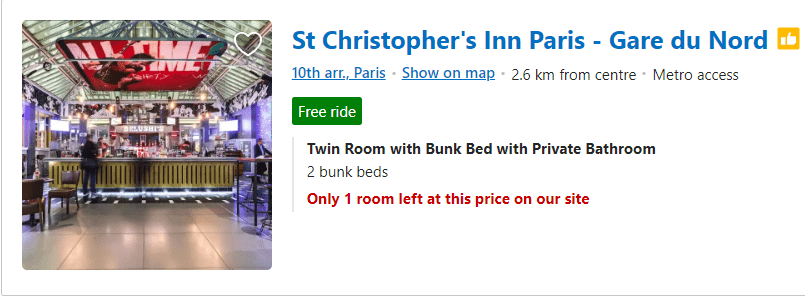
Source: Booking.com
Behavioral design is much more than sales techniques. It creates habits of using the web and mobile apps. Green means “yes,” swipe to the left means “go further,” a circle with motion inside means “loading, wait,” etc.
Web and mobile apps often use the CAR (cue, action, reward) model to teach their users how to interact with the app. You get triggered by the element on the screen, do the necessary action, and get a reward when you hit your goal.
Source: Cathy Heng for Dibbbler
As most businesses go online, we will surely see the development of behavioral design techniques in the years to come.
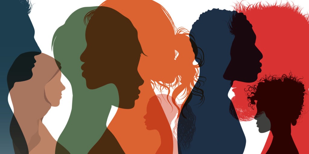
5. Gender neutrality and inclusivity
More and more businesses want to make their websites as inclusive as possible so that even more people can use their services. Inclusivity means adding some additional options to your websites, like making larger well-visible buttons, adding a “listen” option to your text webpages, or a “voice input” option for filling out your registration forms.
Also now, if you use images of people, you need to be more thoughtful so that each visitor can associate the images of people on your webpage with themselves. This means that the images of people should be as diverse as possible.
The stereotypical choice of colors or graphic elements becomes a thing of the past too. A graphic example of stereotypic design is the choice of the pink color for the girls’ section of your online store and the blue color for the boys’ section of your shop.
Gender neutrality should also be used for UX copy. For example, in modern Engish, “his or her” is replaced by “their,” and generalized gender-specific appealing’s such as “girls” or “guys” should be replaced with gender-neutral words.
Particular attention should be paid to the registration forms – along with the “male” and “female” options, there should also be a third neutral option. The gender-neutral trend can be an obstacle for services and products where gender is important, such as dating apps or clothing stores, but businesses and designers are learning to deal with these challenges.
6. Data visualization
If your app provides users with abundant information, make them a service and structure your data so it can be digested easily. Use appropriate chart types and always keep it simple. Choose the top left corner or center of your screen and bright colors to emphasize the most important information.
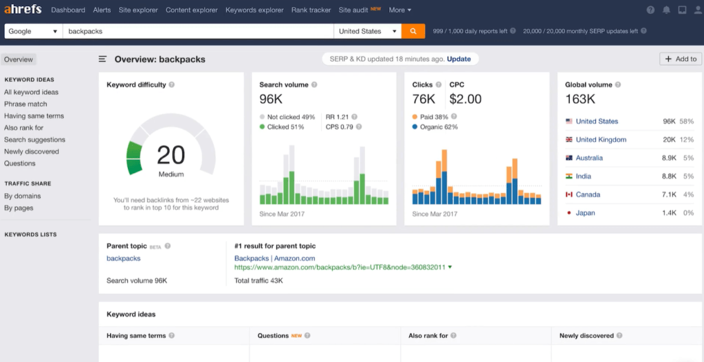
Image source: Ahrefs.com
7. 3D illustrations and animation
Two-dimension illustrations give way to three-dimensional graphics and animation. What looks like a UI solution affects the way people interact with your app too. Admire Amaze is a great example where scrollytelling, gamification, and 3D animation are intertwined to give you the utmost user experience.
(Sometimes animation can take too much time to load which increases the time your user waits for your website to open. Some people might get annoyed with waiting and close your tab without giving you a chance to impress them).
Image source: Admire Amaze
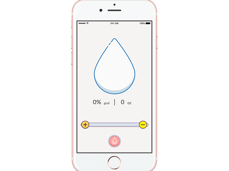
8. Customization and personalization
Users expect your app to be as personalized as possible and get frustrated when they don’t receive what they want.
You can create a customized user experience by asking your user to fill in some forms. For example, if you’re a pedometer app, you can ask your user their age, sex, weight, and height and with this info, you will be able to tell them their speed, the number of steps they make, and the number of calories they burn.
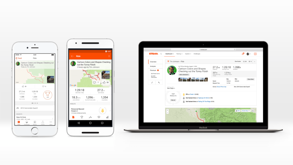
Image source: Strava blog
Personalization is widely used by three types of apps and websites: e-commerce, social media platforms, and streaming platforms. Try to buy wiper blades and most likely somewhere between opening the shop’s tab and getting to the payment page, you will see ads for the cleaning tools and sprays. Choose some songs with the music streaming service and then it will recommend to you some brilliant bands you didn’t know existed. And, we all know how algorithms work in social media, here is just a fun example:

9. Simple, minimalistic design
Minimalism won’t go anywhere. The main reason is that it’s easy for the eye. Minimalism is still trendy in fashion, architecture, interior design, and even brand logos. Monochrome colors and simple typefaces are widely used by websites as well.
When choosing minimalism remember that ultra simplified minimalism can look corporate and less authentic and even be less likable by customers.
Here is a great example of minimalism for web design:
Source: Roman Salo (obys), Dibbbler
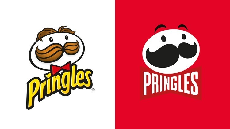
Pringle’s chips rebranding, on the other hand, is the case when (in our opinion), over-simplification has gone too far:
10. Outsized typography
Another UI/UX design trend that simplifies information consumption is outsized typography. A copy can be used as a design element plus, you can easily emphasize the most important text blocks by increasing their type size.
Here are some examples of when oversized typography serves as a separate minimalistic graphic element.
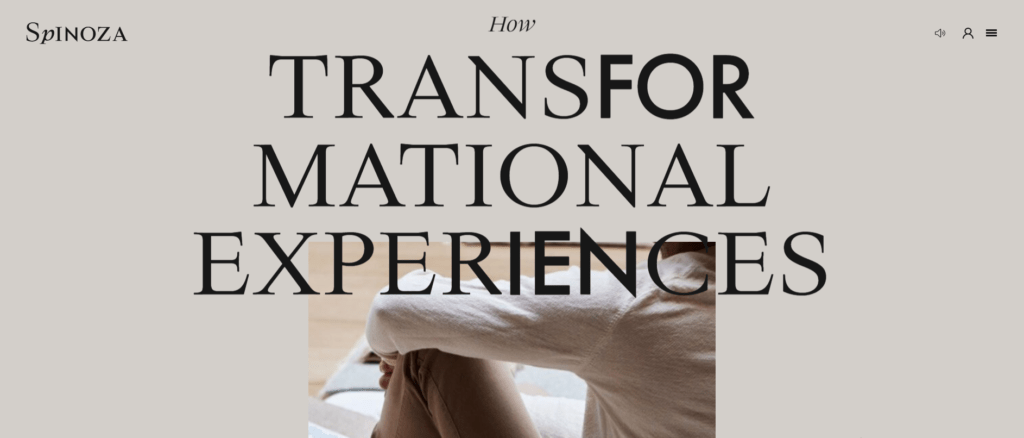
Source: Spinoza.co
Source: Roman Salo (obys), Dibbbler
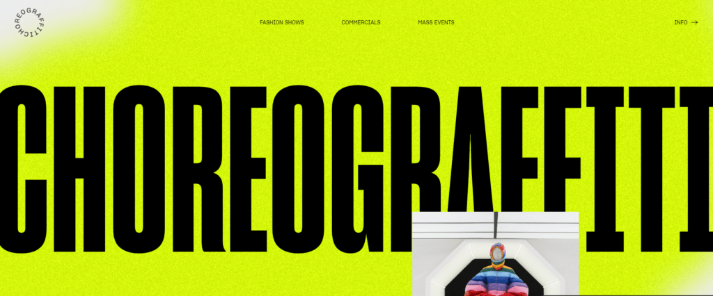
Source: Choreograffiti.com
11. Typefaces
Fancy customized typefaces became a graphic element that complements web design and helps create a coherent brand image. Interactive fonts that change their look on hover experience a resurgence as well.
The trend for customized typefaces is here to stay for a long as more and more design studios start developing fonts for sale. Now, every business can find a typeface that will complement its brand image.
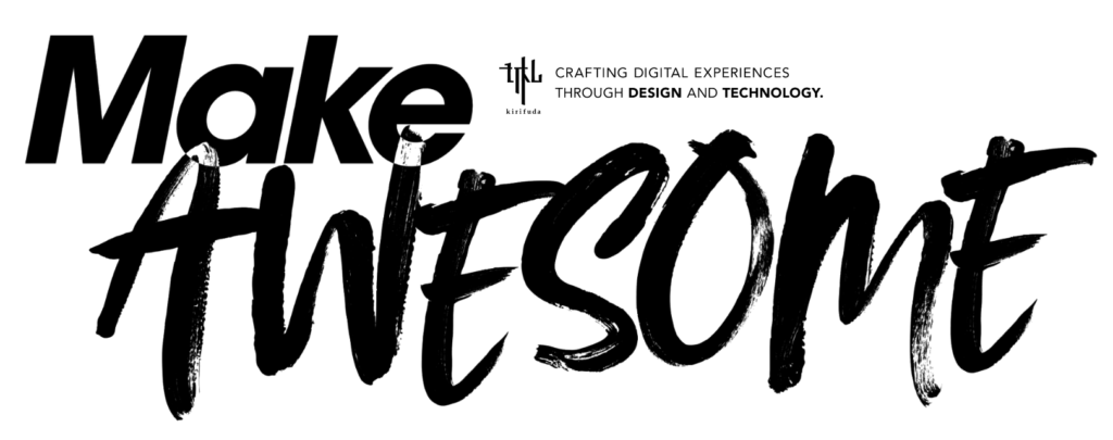
Source: Kirifuda
12. Collage illustrations
Collage illustrations draw attention with the abundance of colors, forms, and textures. They allow you to put multiple elements together and don’t be afraid of overloading your illustration. Collages can also create an impression that the illustration was made by hand, adding more authenticity and retro touch to the website.
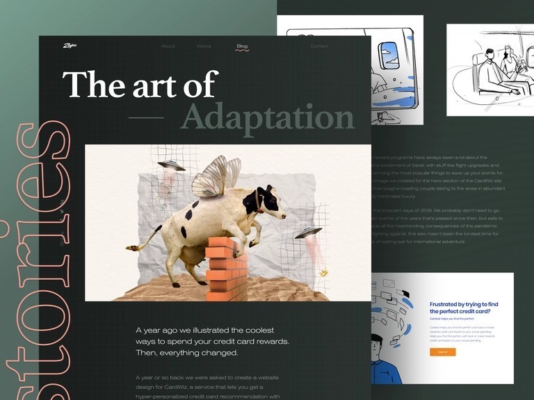
Source: Andrew (Zajno), Dibbbler
13. Dark mode
The dark mode is the UI trend that highly affects the usability of your app. Adding dark mode is the way to show your users that you care about their eyes and want to make their use of your app as comfortable as possible. Dark mode got so many likes that Chrome even decided to offer an extension that can turn almost all websites dark.
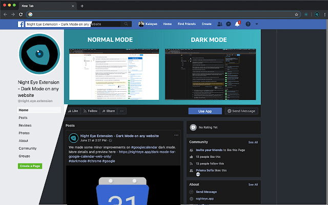
Source: Chrome web store – Dark Mode Night Eye
The latest UI/UX design trends by Stanislav Burleyev

MWDN designer Stanislav Burleyev told us a bit about his perception of design trends, talked about artificial intelligence in design, and gave links to some of his favorite websites.
1. Some UX designers predict that the copy will gain importance while the use of illustrations will decrease. In contrast, other experts believe that graphic elements are primarily and text is not that important. What do you think about it?
In my opinion, you can’t juxtapose text with graphic elements. They are both crucial for the users’ experience. Moreover, they are mutually supporting pieces. You can’t have a truly good UX design without a nice copy and you can’t make texts work if they were put in a poorly designed snippet.
2. What UX design trends are going to be popular in the near future?
I believe that in four to five years VR and AR technologies are going to be so widespread that this will change the way we see UX design. Soon, we will all draw and develop elements for augmented reality and multiverse systems. On the other hand, AR and VR might as well turn out to be a bubble with no future.
Today, more and more businesses want to emphasize their uniqueness with modern trendy design, so more and more companies will want to make their websites fashionable and stylish.
Overall, what all customers need is a great UX design. For example, many people prefer Apple to other smartphones. They want to stick to Apple because of the small elements in UX design that change their interaction with the phone. The devil is in the detail.
I also believe that the future lies with clear and concise UX design and it doesn’t matter what fonts or illustrations you use. The thing is, some of the trends described above are suitable only for particular clients. Your choice of technologies and trends directly correlates with the resources available to your client.
3. So, it’s the business needs that are important not the trends, right?
Of course! I would go further and assume that the business needs of your app are the keystone for your design.
For example, I had a case when the client made additional marketing surveys during the development and recognized that their target audience was a bit older and had a particular craze about fashion. So we had to change the whole interface from bright teenage colors to fashionable fonts and monochromatic schemes with sharp contrasts. So, whatever you do, you should always think about the business needs of your client first.
4. What do you think of the anti-design?
The overwhelming majority of people don’t understand design, they can only feel it. Is it comfortable? Do I like it? Does it require some additional actions? The thing with anti-design is that it makes you explore and research the website or app. Most people don’t want to do that. They’re looking for the easiest and simplest way to get from A to B.
Briefly, anti-design is something that only designers can truly appreciate. I think it’s a great way to show off, add this work to your portfolio, or start the buzz for promotional goals. However, anti-design might be not the best choice for the commercial project.
5. What’s your favorite design case with MWDN?
There are many 2022 cases that I love, though as they are still in progress, I can’t talk about them. If we go several years back, NAX would be my favorite. This is a B2B technology that allows you to make massive payments to clients. It is a huge innovative system.
What I love the most about the design of this app is that it’s useful. In a nutshell, our design sells the technology, which is a benefit for the client and it is simple and comfortable to use for the final customer.
6. Have you come across websites with particularly good UI/UX designs recently?
I always look for new sources of inspiration, and there are days when I visit dozens of websites and apps. So, in my case “particularly good” would be those that I can still remember. These are the website for a mobile phone called Nothing and the web studio that offers customized fonts, it’s called ABCDinamo.
What I loved the most about Nothing is that the design of the website fully corresponds to the design of their phone. The uniqueness of the phone is that it’s partially transparent, so you can see nuts and screws under its shell. The same is with the website – because of the small graphic details, it seems like you’re looking at the phone when you’re scrolling the webpage.
ABCDinamo is a quintessential example of anti-design. Rules are broken and for me, it looks beautiful.
Summing up
Making the first impression takes seven seconds. We believe that the time is even shorter when it comes to websites. To make your users happy (elevate users’ experience) and stimulate sales (boost income), you have to invest in good design. Do so by choosing MWDN, a design & development company with hands-on experience and a good reputation on the market.